







Table of Contents
Key Takeaways
Verdict: The FUUMUUI Sunlit 24-Color Opaque Watercolor Set features warm, luminous shades, four shimmering accents, and versatile transparent-to-opaque coverage—perfect for painting light, warmth, and atmosphere.
- A Complete Warm Palette: Twenty warm colors create a smooth progression from pale yellow and golden ochre to amber, orange, terracotta, and earthy brown.
- 4 Shimmering Colors: Gold, bronze, and other metallic-inspired tones bring reflective highlights and luminous details into a painting.
- From Washes to Opaque Layers: Dilute the paint for glowing wet-on-wet backgrounds or use a richer mixture for defined shapes and stronger color.
- Made for Sunlit Subjects: Explore golden landscapes, autumn leaves, warm architecture, flowers, food illustration, and expressive color studies.
What if one watercolor palette could capture an entire day of sunlight?
Morning begins with pale yellow. Afternoon glows in gold and amber, while sunset deepens into orange, terracotta, and warm brown.
The FUUMUUI Sunlit 24-Color Opaque Watercolor Set brings these colors together in one connected palette, offering a simple way to explore how light changes color, texture, and mood.
24 Warm Colors in One Palette
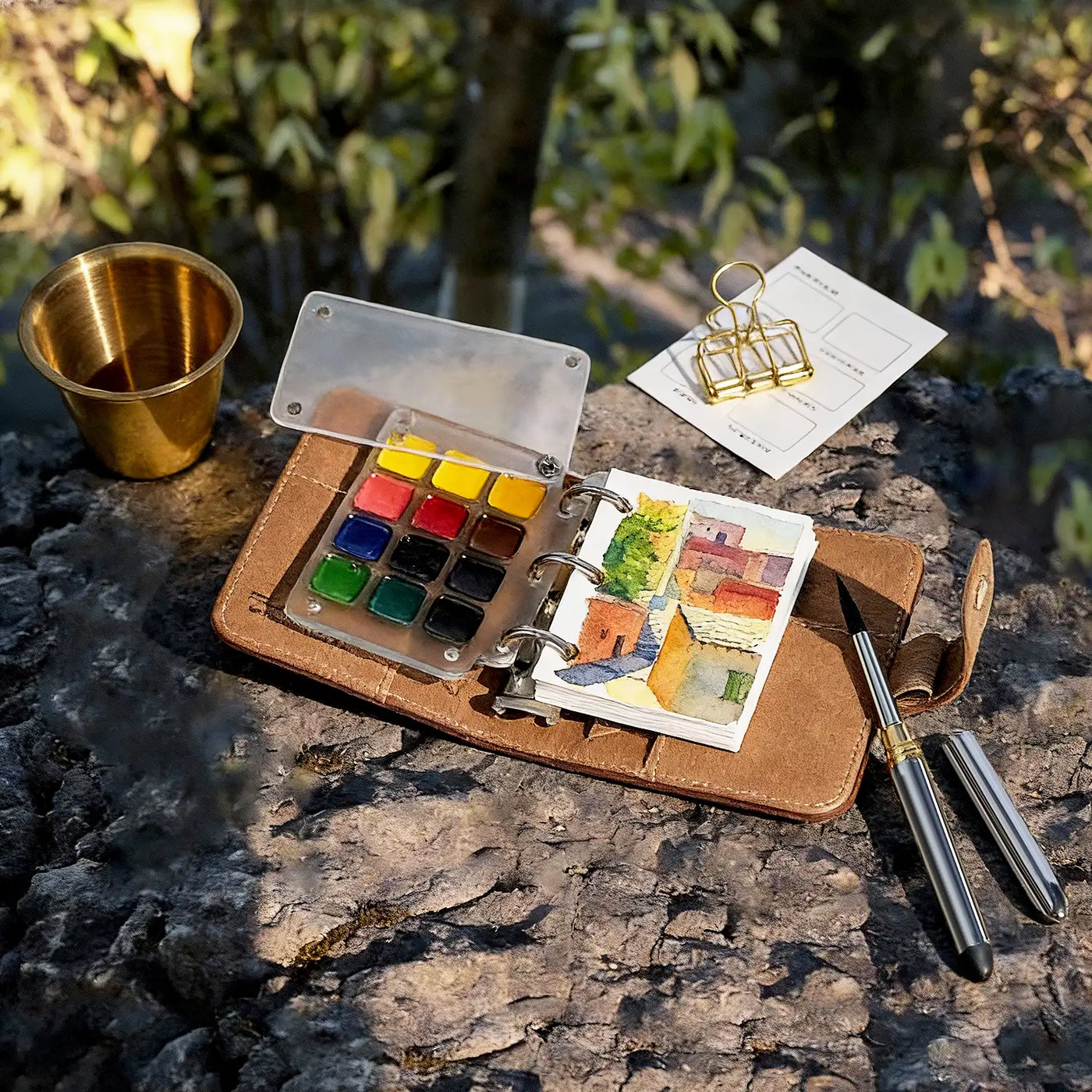
Open the metal case and the color story is immediately clear.

The palette moves naturally from light to dark:
- Soft cream and pale lemon
- Bright yellow and golden ochre
- Amber, coral, and vivid orange
- Burnt orange and terracotta
- Sienna and deep earthy brown
- Four shimmering accent colors
This gradual arrangement makes color selection easier. Choose a pale shade for highlights, a golden midtone for the main subject, and a deeper earth color for shadows.
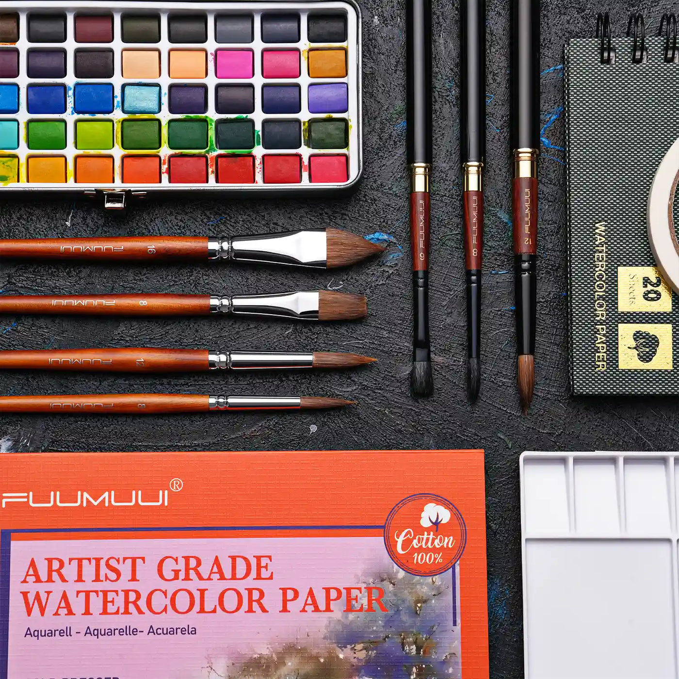
Each shade sits in an individual white pan, keeping the colors clearly separated and easy to reach. The inside of the lid also offers space for mixing and diluting colors.
What Can You Paint with Sunlit?
Warm colors can suggest more than temperature. They can communicate time of day, changing seasons, natural materials, and the emotional atmosphere of a scene.
Because the paint can be diluted or applied more richly, the same palette can create soft backgrounds, defined shapes, layered details, and bold finishing marks.
Golden Landscapes
Landscapes are a natural starting point for the Sunlit palette.
Begin with diluted yellow, amber, and orange for a soft wet-on-wet background. Once the first layer dries, add trees, buildings, paths, and shadows with deeper earth colors.

The palette works especially well for:
- Golden fields and autumn trees
- Sunsets and glowing clouds
- Desert rocks and warm earth
- Country houses and distant hills
- Loose outdoor color studies
Because the colors are closely related, even a landscape built from a few simple shapes can feel balanced and complete.
Architecture and Everyday Scenes
Warm colors are everywhere: brick walls, tiled roofs, wooden doors, café lights, fruit, flowers, ceramics, and sunlight falling across a table.
For stronger shapes, use a creamier paint mixture. Build the main color areas first, then add windows, rooflines, shadows, and smaller details after the surface dries.

Try using the palette for:
- Sunlit houses and storefronts
- Terracotta roofs and old walls
- Café interiors and travel journals
- Fruit, food, and floral illustrations
- Handmade cards and sketchbook studies
A pale wash, several warm shapes, and one or two dark accents may be all you need to describe an entire scene.
Autumn Leaves and Natural Details
The warm color progression is especially useful for autumn subjects.

Start a maple leaf with a luminous yellow center. Blend orange around the edges, then use burnt sienna or brown to define the veins, stem, and sharper contours.
This simple light-to-dark process can also be used for:
- Flower petals
- Fruit and vegetables
- Tree bark
- Dried plants
- Natural texture studies

A small amount of shimmering color can be added along an edge or vein to create a subtle reflective highlight.
Explore More with a Limited Palette
A palette focused on one color family may seem restrictive, but it can make painting decisions easier.
Since the colors already work together, you can spend more time exploring water control, value, edges, and layering.
Try a Three-Color Study
You do not need to use all 24 colors in every painting.
Choose three related shades and explore what they can do:
- Cream, golden yellow, and brown for a landscape
- Yellow, orange, and burnt sienna for an autumn leaf
- Pale yellow, terracotta, and deep brown for architecture
- One warm color and one shimmer for a decorative study
Working with fewer colors helps you understand each shade while keeping the finished painting visually unified.
Change the Color with Water
The amount of water can completely change how a color behaves.
Use more water for:
- Transparent washes
- Soft backgrounds
- Gentle transitions
- Atmospheric light
Use a richer paint mixture for:
- Defined shapes
- Stronger coverage
- Darker shadows
- Final details
This flexibility allows one color to move from a quiet glow to a bold, opaque mark.
Mix New Warm Colors
The 24 shades can be used directly, but color mixing creates even more possibilities.
- Mix cream with yellow for softer light.
- Blend yellow and orange for glowing amber.
- Add burnt sienna to orange for rust, brick, or terracotta.
- Combine deeper earth colors to create warm shadows without immediately using black.
- Layer shimmering colors over dry paint for luminous accents.
The palette provides 24 starting points. Water, mixing, and layering determine how far those colors can go.
Why Choose Warm Opaque Watercolor?
A focused warm palette gives a painting an immediate visual direction. Instead of searching through unrelated colors, you can explore the variety that exists within one connected color family.

Opaque watercolor also supports several painting styles:
- Soft wet-on-wet skies and backgrounds
- Solid shapes for buildings and illustrations
- Layered leaves, flowers, and natural details
- Light colors applied over dry, darker layers
- Shimmering highlights added at the end
This makes Sunlit approachable for beginners while still offering creative possibilities for more experienced artists.
Warm paintings do not always have to feel bright or cheerful. Depending on the values and color combinations, they can also feel calm, nostalgic, earthy, or dramatic.
24 Colors, One Sunlit World
Light moves across fields, catches the edge of a leaf, settles on an old wall, and turns ordinary scenes into something worth painting.
The FUUMUUI Sunlit Opaque Watercolor Set gathers those changing moments into one coordinated palette. Use it lightly for glowing washes, build richer layers for stronger forms, or finish with a touch of shimmer.
24 colors, countless warm possibilities, and one simple invitation: follow the light.


