
Table of Contents
Review Snapshot: Quick Verdict
The Pros
- Distinct Surface Behaviours: Rough, Cold Press, and Hot Press each produced different results in pigment movement and diffusion.
- Consistent Performance: All three papers handled repeated wetting well and supported layering and glazing.
- Pigment Interaction: Prussian Blue (PB27) and Ochre (PBr7) behaved differently, showing how pigment characteristics influence watercolor results.
- Practical Comparison: Testing all three surfaces side by side and using them in the same landscape painting made their differences easier to see.
Things to Note
- Results Depend on the Pigment: The same paper surface can produce different results depending on the pigment used.
- No Single Best Surface: Each paper offers different characteristics, so the right choice depends on your preferred painting style and the effects you want to achieve.
As watercolor artists, we often talk about choosing the right paper—but how much does the paper surface actually affect the way watercolor behaves?
To explore this question, I tested three FUUMUUI watercolor paper surfaces—Rough, Cold Press, and Hot Press—using two pigments with noticeably different characteristics: Prussian Blue (PB27) and Ochre (PBr7).
Rather than beginning with a finished painting, I wanted to first understand how watercolor interacts with the paper itself. Through a series of controlled tests, I explored how each surface affected pigment activation, diffusion, and lifting, and then applied those observations to a simple landscape painting.
The results showed that paper surface plays an important role in watercolor behaviour—but it is only part of the equation. The characteristics of the pigment itself can be just as influential.
A Quick Look at the Results
Before getting into the testing process, here are the key observations from comparing the three FUUMUUI watercolor paper surfaces.
What I Loved
- Each paper demonstrated a distinct watercolor personality.
- All three surfaces handled repeated wetting without damage.
- The papers responded consistently throughout the testing process.
- All three surfaces supported layering and glazing techniques.
Best Uses for Each Surface
- Rough Paper: Textural landscapes, organic watercolor effects, and expressive painting styles.
- Cold Press Paper: General watercolor painting, balanced diffusion and control, and everyday landscape work.
-
Hot Press Paper: Smooth washes, precise edges, and detailed work such as Line & Wash and botanical art.
Why Test Watercolor Paper Surfaces?
As a watercolor artist, I am always interested in understanding how paper surface influences paint behaviour.
Instead of immediately creating a finished painting, I wanted to take a closer look at what happens when watercolor meets different paper surfaces.
For this review, I compared three FUUMUUI watercolor paper surfaces:
To keep the testing consistent, I used two pigments with noticeably different characteristics: Prussian Blue (PB27) and Ochre (PBr7).
My goal was simple: Can differences in watercolor paper surface be observed through controlled testing, and do those differences carry through into a finished painting?
The Testing Process
To compare the three surfaces fairly, I used the same two pigments, water source, brush, and application techniques throughout the tests.
The testing process covered three areas:
- Paint Activation: How readily the dry pigment reactivates when water is applied.
- Wet-in-Wet Diffusion: How the pigment moves across a pre-wetted surface.
- Lifting: How easily pigment can be removed while wet and after drying.
Watch the full testing video below to see how the three FUUMUUI watercolor papers perform.
Test 1: Paint Activation
For the first test, pigment was applied directly to dry paper and then activated with clean water.
Prussian Blue

Prussian Blue immediately revealed differences between the three paper surfaces.
- The Rough paper interrupted the movement of the pigment and produced more textured diffusion patterns.
- The Cold Press paper allowed the pigment to move in a more controlled way.
- The Hot Press paper produced the smoothest and widest pigment spread.
Ochre

Repeating the same test with Ochre produced a different result.
Although Hot Press once again allowed the greatest movement, the differences between the three papers were less dramatic.
The Ochre pigment remained more localized and showed less mobility across all three surfaces.
This early observation suggested that watercolor behaviour is influenced not only by the paper surface, but also by the characteristics of the pigment itself.
Test 2: Wet-in-Wet Diffusion
The second test explored how pigments moved across a pre-wetted paper surface.
Prussian Blue

Prussian Blue demonstrated strong mobility.
The Hot Press paper allowed the greatest diffusion, while the Rough paper produced the most restrained and textured spread.
Ochre

Ochre behaved very differently.
Its diffusion remained far more controlled, with all three papers producing more localized movement than was observed with Prussian Blue.
One of the most interesting findings of the entire study emerged from this test: Paper behaviour and pigment behaviour cannot be separated.
The paper influences how the pigment moves, but the pigment itself plays an equally important role in determining the final result.
Test 3: Lifting
The lifting test was performed in two stages.
The upper section of each sample was lifted while the paint was still wet, while the lower section was allowed to dry completely before lifting was attempted.
Wet Lifting

While wet, Prussian Blue lifted reasonably well on all three surfaces.
Dry Lifting

Once dry, however, only limited lifting could be achieved without excessive scrubbing.
Ochre behaved similarly, although it appeared even more resistant to removal after drying.
Interestingly, this characteristic proved beneficial from a painting perspective.
Although neither pigment lifted dramatically once dry, both remained stable enough to support layering and glazing techniques without excessive disturbance to previous washes.
Putting the Results Into Practice

After completing the individual tests, I wanted to see whether the differences observed on the paper samples would translate into an actual painting.
To do this, I created the same minimalist landscape on all three paper surfaces using only: Prussian Blue (PB27) and Ochre (PBr7).
The differences observed during testing became immediately visible in the finished paintings.
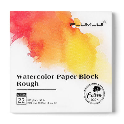
Rough Paper: Texture & Atmosphere
The Rough paper produced the most atmospheric result.
Its stronger surface texture created organic transitions and added a distinctive textural quality to the painting.
This made it particularly suited to textural landscapes, organic watercolor effects, and expressive painting styles.
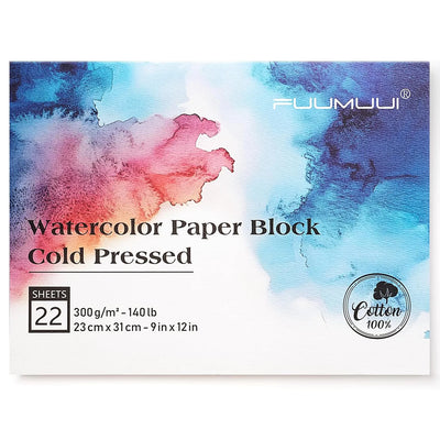
Cold Press Paper: Balance & Control
The Cold Press paper delivered the most balanced painting experience.
It combined texture, control, and diffusion, creating a versatile surface for general watercolor painting and everyday landscape work.
Bloc de papier aquarelle 100% coton Fuumuui
$36.00$18.99
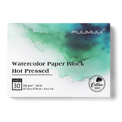
Hot Press Paper: Smooth & Precise
The Hot Press paper produced the smoothest transitions and cleanest edges.
The result had a more polished appearance, making the surface well suited to smooth washes, precise edges, and controlled detailed work, such as Line & Wash and Botanical Art.
What Did We Learn?
This study demonstrated that watercolor paper surfaces can significantly influence pigment behaviour, but the pigment itself also plays an important role.
Prussian Blue consistently showed greater mobility, while Ochre remained more localized and resistant to change. Across the three surfaces, Rough emphasized texture and atmosphere, Cold Press offered a balance of diffusion and control, and Hot Press produced smoother transitions and cleaner edges.
Choosing watercolor paper is therefore not simply about finding one surface that performs best in every situation. Different surfaces support different painting styles.
The best paper is the one that supports the artist’s preferred painting style.


