






Table of Contents
Key Takeaways
Verdict: The right watercolor paint balances format, pigment behavior, and lightfastness to suit your painting style and needs.
- Format Matters: Choose pan paints for portability, tube paints for large washes, or semi-solid paints for easy reactivation and layering.
- Read the Label: Look beyond color names to Pigment Index Codes and lightfastness ratings to understand a paint’s composition and performance.
- Understand Pigments: Color bias and pigment count affect mixing clarity, while too many pigments can lead to muddy colors.
- Build Your Palette: Start with 12-24 colors and expand to larger or specialty sets as your painting style and needs develop.
Choosing watercolor paints is not just about picking your favorite colors. The paint’s format, pigments, and properties can all affect how it behaves on paper.
Knowing what to look for makes it easier to choose watercolor paints that suit your painting style, budget, and needs.
Understanding Watercolor Paint Basics
What Is Watercolor Paint?
Watercolor paint is a water-soluble painting medium made primarily from pigments and a binder. When mixed with water, it can be applied in transparent washes, layers, or more concentrated strokes.
It contains a few key components, each playing a different role:
- Pigments: Provide the color and influence properties such as transparency, granulation, staining, and mixing behavior.
- Binder: Usually gum arabic, which holds the pigment together and helps it adhere to the paper.
- Humectants and additives: Ingredients such as glycerin, honey, or wetting agents can affect moisture retention, rewetting, and paint flow.
Key Properties of Watercolor Paint
A few fundamental properties affect how watercolor paint looks and behaves on paper:

- Transparency: Transparent watercolors allow the white of the paper to show through, creating luminosity. Opaque watercolors provide stronger coverage.
- Granulation: Granulating pigments settle unevenly as they dry, creating a soft, grainy texture that works well for natural subjects.
- Staining: Staining colors bond tightly to paper and are difficult to lift once dry. Non-staining colors are easier to lift or soften.
- Lightfastness: Indicates how well a pigment resists fading when exposed to light, which is important for artwork intended for long-term display.
Why Do Watercolor Paints Vary in Price?
Price is influenced by the type and cost of pigments, pigment concentration, manufacturing, and overall formulation. Some pigments are naturally more expensive or difficult to produce, while others are widely available.
A higher price does not automatically mean a color is better for every painter. What matters is whether the paint's characteristics match the way you work.
Types and Grades of Watercolor Paint
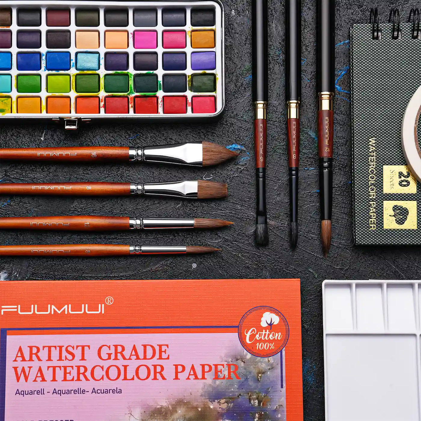
The format of watercolor paint directly affects how you store, activate, and use it in your studio or on the go.
|
Type |
Pros |
Cons |
|
Highly portable; ideal for travel and plein air painting |
Can take more effort to activate; less efficient for large washes |
|
|
Easy to pick up and mix; efficient for large washes |
Less portable; can dry out during long-term storage |
|
|
Easy to pick up and activate; vibrant color |
More sensitive to heat and humidity; may soften in warm, humid conditions |
|
|
Liquid Watercolor |
Highly fluid and vibrant; suitable for spraying and large background areas |
Can be harder to control and less beginner-friendly |
Student-Grade vs. Professional Watercolor
Keep in mind that student and professional paints are different grades, not formats.
- Student-Grade Watercolor: More affordable and practical for practice and learning. These paints may use more economical pigments or substitute colors.
- Professional Watercolor: Generally offers higher pigment concentrations and a wider selection of pigments, including more single-pigment colors, giving artists greater control over color characteristics.
A higher grade does not automatically guarantee better art. The best choice depends on your experience, budget, and intended use.
How to Read a Watercolor Paint Label
The color name is only part of the story. Pigment codes, “Hue” designations, and lightfastness ratings reveal more about a paint’s composition and performance.

Pigment Codes
Look for the Pigment Index Code on the label or color chart. Common prefixes include:
- PB — Pigment Blue
- PY — Pigment Yellow
- PR — Pigment Red
- PG — Pigment Green
- PV — Pigment Violet
- PBr — Pigment Brown
- PW — Pigment White
- PBk — Pigment Black
The code identifies the pigment used, which is more useful for understanding a color’s characteristics than the commercial name alone.
Single-Pigment vs. Multi-Pigment
-
Single-pigment colors contain one pigment, making them easier to predict when mixing.
-
Multi-pigment colors combine two or more pigments to create convenient premixed shades.
What Does “Hue” Mean?
A “Hue” label indicates that a paint uses alternative pigments to recreate a traditional color. For example, Cadmium Yellow Hue uses alternative pigments to resemble cadmium yellow.
Note: “Hue” does not automatically mean non-toxic or lower quality. Check the pigment code and manufacturer’s information if composition or safety matters to you.
Lightfastness
Lightfastness measures how well a pigment resists fading when exposed to light over time. Manufacturers may use stars or Roman numerals to indicate the level of resistance.
For example, our color charts use a star-rating system:
- ★★★★ / ★★★★★ — High to maximum lightfastness
- ★★★ — Moderate lightfastness
- ★ / ★★ — Lower lightfastness
How Pigments Affect Watercolor Mixing
Understanding how pigments interact makes watercolor mixing more predictable.
- Color Bias Matters: Similar-looking paints can produce very different results when mixed. A green-leaning blue can create a cleaner green with yellow, while a red-leaning blue may produce a more muted result.
- Why Mixes Turn “Muddy”: Muddy colors often result from combining too many pigments or pairing pigments with opposing color biases.
- The Power of a Limited Palette: A few colors can go a long way. Red, yellow, and blue can be mixed to create a surprisingly wide range of hues.
How to Build Your Watercolor Palette

There is no single “correct” watercolor setup. The right palette depends on where you paint, what you paint, and the techniques you prefer.
For Beginners: Start with 12-24 Colors
A 12- or 24-color set provides enough variety to practice mixing without making your palette overwhelming. Our 12- and 24-color sets are a practical starting point for everyday painting.
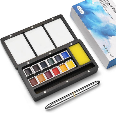
For Travel & Plein Air: Choose a Portable Set
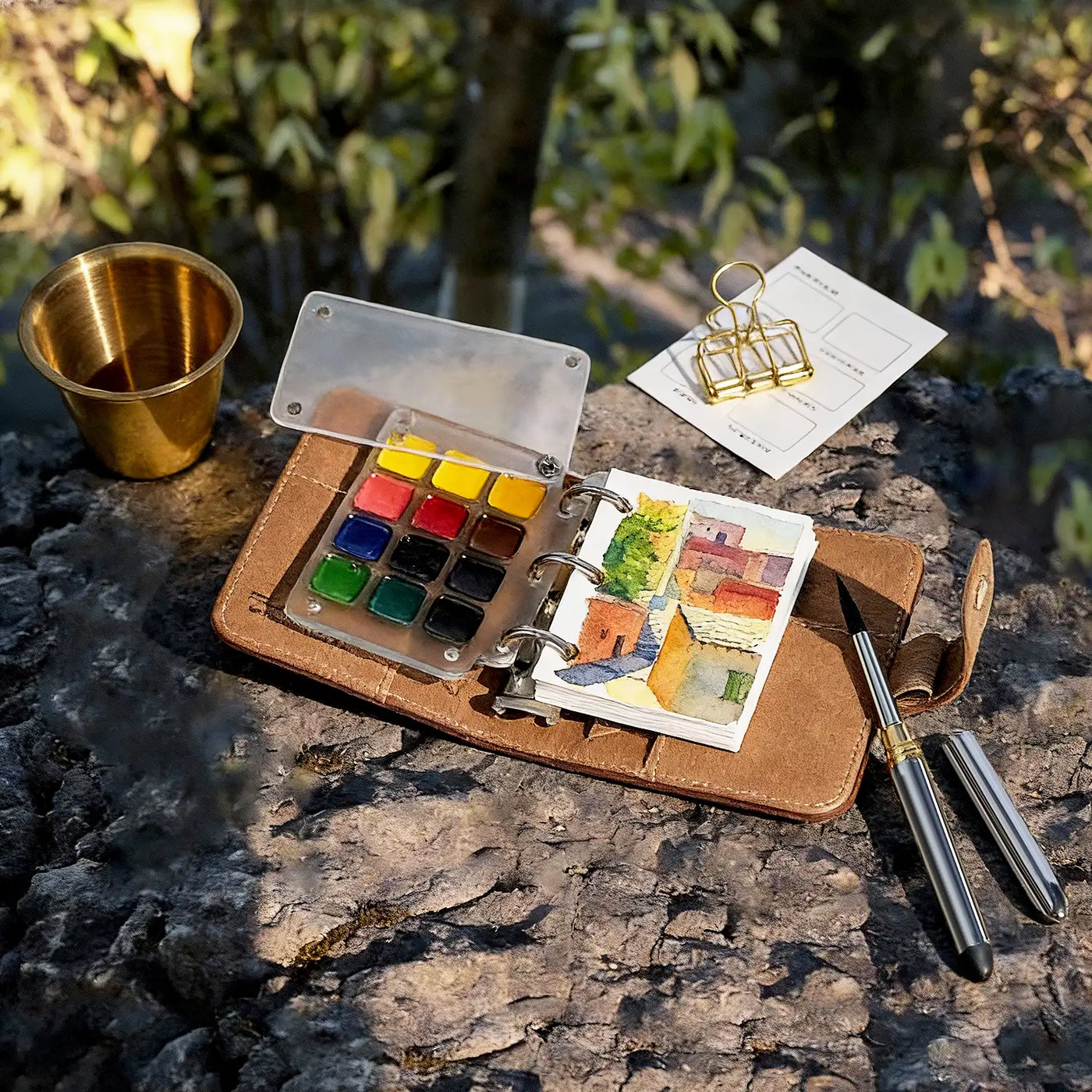
If you often paint outdoors or while traveling, choose a compact set that is easy to carry and ready to use. Our Watercolor Travel Set is a convenient option for painting on the go.
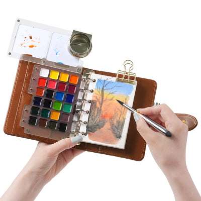
For Illustration & Journaling: Try Opaque Watercolors
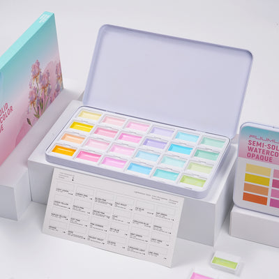
If you enjoy illustration, journaling, or layered techniques, consider soft, semi-solid formulas that rewet easily and offer good coverage. Our 24-Color Opaque Watercolors are a natural fit for these styles.
For More Color Variety: Move Up to 48+ Colors
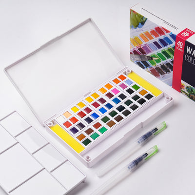
For studio work or subjects that call for a wider range of colors, larger sets can reduce the need for frequent mixing. Our 48- to 60-color sets offer more ready-to-use hues to work with.
For Accent Effects: Add Metallic or Pearlescent Colors
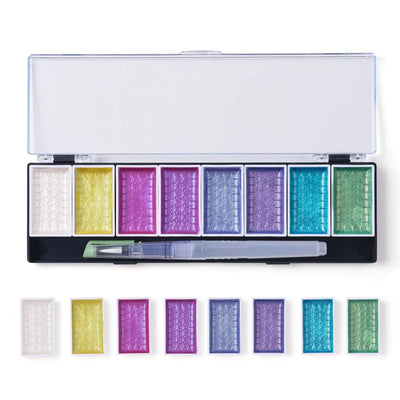
Once you have a basic palette, specialty colors can add extra effects to your work. Our Metallic and Pearlescent Sets are useful for calligraphy, dark paper, or subtle shimmering accents.
Watercolor Paint FAQs
Q1: What Watercolor Paint Is Best for Beginners?
A: A 12- or 24-color set is a practical starting point for beginners. It offers enough variety to practice mixing without making your palette overwhelming.
Q2: What Are the Essential Watercolor Colors to Start With?
A: A split-primary palette with warm and cool versions of red, yellow, and blue is a versatile starting point. Adding Burnt Sienna or Yellow Ochre is useful for natural subjects.
Q3: Are Pan or Tube Watercolors Better?
A: Neither is better for everyone. Pan watercolors are convenient for travel, while tube watercolors are useful for large washes and studio painting.Neither is better for everyone. Pan watercolors are convenient for travel, while tube watercolors are useful for large washes and studio painting.
Q4: Can Tube Watercolor Be Used Like Pan Watercolor?
A: Yes. Squeeze tube paint into a palette, let it dry, and reactivate it with water when needed.
Q5: Do Watercolor Paints Expire or Go Bad?
A: Watercolor paints generally don’t have a strict expiration date and can remain usable for many years with proper storage. Keep them dry, well protected from moisture, and away from extreme heat.
Q6: What Is the Difference Between Student and Professional Watercolor?
A: Professional watercolor generally offers higher pigment concentrations and a wider selection of pigments, while student-grade watercolor is more affordable and designed for practice.
Choose Your Colors, Start Painting
The right watercolor paints come down to your painting style, color needs, and budget. Start with the basics, build a palette that works for you, and add new colors as your skills grow.
Choose the watercolor paints that fit your style and make your next piece your own.

Crie em qualquer lugar com um conjunto de tinta de aguarela premium. Temos em stock as melhores paletas profissionais e...


