










Table of Contents
Key Takeaways
Verdict: The FUUMUUI Purple Sketchbook Set brings a fresh approach to everyday watercolor painting with a distinctive purple cover and a 36-color palette designed for exploring values and color mixing.
- Signature Design: A FUUMUUI purple sketchbook paired with a light grey palette for a distinctive look.
- 36-color Palette: Combines 24 opaque semi-moist grey watercolors with 12 primary colors, offering more possibilities for color mixing and creative exploration.
- Explore Grey: Work with warm and cool greys to study light, shadow, and tonal variation.
- Mix Your Own Colors: Combine primary colors with greys to create new shades and explore different color relationships.
- More color Options: Choose from different palette configurations to suit your painting preferences.
Some watercolor palettes are designed around a wide range of colors. Others invite you to approach color in a different way.
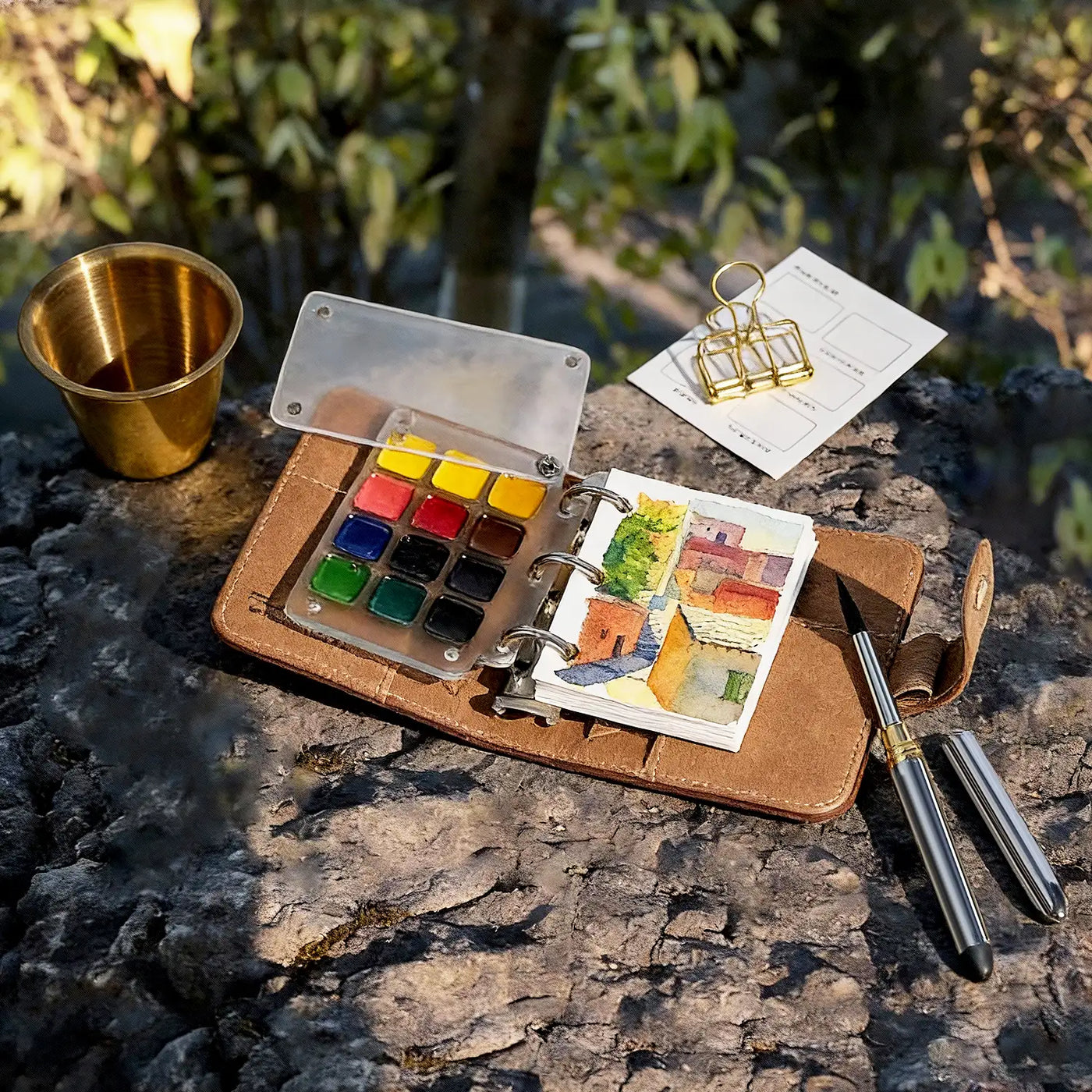
The new FUUMUUI Purple Sketchbook Set brings together the brand’s signature purple cover, a light grey palette, and a thoughtfully arranged selection of greys and primary colors. Designed for artists who enjoy exploring values, color relationships, and mixing, it offers a fresh take on the traditional watercolor travel set.
A Signature Purple with a New Color Combination

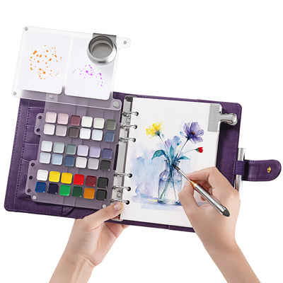
The sketchbook features FUUMUUI’s signature purple cover, paired with a light grey palette for a clean, distinctive look.
The combination of purple and grey gives the set a style of its own. Whether placed on your painting desk, tucked into a sketchbook bag, or carried along for everyday sketching, it fits naturally into your creative routine.
Beyond its appearance, the palette introduces a different approach to color selection, bringing together two groups of colors that can be used individually or mixed to create new shades.
36 Colors for a Different Approach to Color Mixing
At the heart of this new set is a 36-color palette that combines 24 opaque semi-moist grey watercolors with 12 primary colors. Rather than focusing only on a broad range of ready-made hues, this combination gives artists more room to explore value, tone, and color relationships through mixing.
24 Shades of Grey: More Than Black and White
Grey is often used to darken colors or create shadows, but its role in painting goes much further. Warm and cool greys can influence the mood of a scene, help establish light and shadow, and bring subtle variations to a wide range of subjects.
With 24 different greys to choose from, artists have more options for working with value and tone without relying on just a few shades of black and white.

These colors can be especially useful for:
- Light and shadow studies: Explore different values and build a clearer sense of form.
- Architecture and urban sketching: Capture the tonal variations of buildings, streets, and other structures.
- Still life and everyday subjects: Create subtle changes in tone without introducing too many colors.
- Grey-toned compositions: Work with a more restrained palette while keeping the painting visually interesting.
The opaque nature of these colors also offers another way to approach watercolor painting. Alongside traditional transparent washes, you can experiment with more solid areas of color and build up layers to create depth and visual weight.
The semi-moist format keeps the colors neatly arranged in the palette, making them easy to carry and ready to use whenever inspiration strikes.
12 Primary Colors for More Mixing Possibilities
A palette centred on grey doesn't mean your paintings have to stay within a monochromatic range. Below the 24 greys, the set includes a row of 12 primary colors, giving you more room to experiment with color mixing.
These colors can be used on their own or combined with the greys to create different color relationships. Adding a small amount of color can shift a neutral shade towards a warmer or cooler tone, while also bringing more variation to an otherwise restrained grey composition.

With both groups of colors in one palette, you can:
- Mix primary colors with grey to create softer, more muted shades.
- Adjust the warmth or coolness of a grey depending on the subject.
- Introduce small areas of color into a mostly grey painting.
- Experiment with different color combinations without changing palettes.
The two color groups work together in different ways. You can focus on value studies using the greys alone, or introduce the primary colors when you want to explore more complex color combinations.
A Sketchbook Set for Different Ways of Painting
Whether you enjoy studying light and shadow, painting everyday objects, or experimenting with color combinations, this sketchbook set offers a different starting point for your work.
You might begin by using the greys to establish the shapes and values of a subject, then introduce the primary colors to adjust its temperature, depth, and overall mood.

For example, you could:
- Start with a grey underpainting to map out the main shapes and values.
- Add selected colors to bring warmth or contrast to the composition.
- Mix the greys and primary colors to create a more unified color palette.
There is no single way to use the palette. The two groups of colors simply give you more options to work with, depending on the subject and the way you like to paint.
The set is also available in other color configurations, including the original color selection, so you can choose the combination that best suits your painting habits.
A Familiar Sketchbook, a Different Color Experience
The FUUMUUI Purple Sketchbook Set brings together a distinctive purple design and a 36-color palette of greys and primary colors, offering a fresh way to approach everyday watercolor painting.
Whether you enjoy subtle grey-toned compositions or experimenting with color mixing, this set gives you more room to explore.
Explore the FUUMUUI Purple Sketchbook Set and choose your favorite color combination.


