


Table of Contents
Review Snapshot: Quick Verdict
The Pros
- Exceptional Coverage: The opaque formula offers excellent covering capacity and vibrant pigments that allow for subtle layering, even over darker tones.
- Professional Presentation: High-standard packaging and design make the sets feel like a premium product, ideal for professional use or gifting.
- Premium Brush Ergonomics: The dual-tip brushes feature a pleasing weight and professional black-and-gold aesthetic that rests comfortably in the hand.
- Forgiving Nature: Unlike traditional transparent watercolours, these allow for pigment "lifting" and corrections, making the medium more approachable for beginners.
- Curated Palettes: The distinct sets (Muted, Earthy, Vivid) provide unique, specialized tones like "Green Grey" that simplify complex mixing for natural landscapes.
User Tips
- Watercolour Fundamentals: While opaque and layering-friendly, it remains a watercolour medium; following "light to dark" rules yields significantly better results than an acrylic-style approach.
- Highlight Management: For the cleanest highlights, it is best to utilize the white of the paper rather than relying solely on Titanium White overlays.
For veteran artists, mastering a single medium is a lifelong pursuit. We spend decades learning the rules of our chosen craft, but the true test comes when we step outside our comfort zone. Can a lifetime of expertise in one medium be successfully adapted to another?
Recently, we received an insightful review from Zara Kimbley-Henry, an acrylic artist of 35 years. She put our Opaque Watercolour range to the test to see if her professional acrylic techniques could "tame" this new medium. Here is her experience and the lessons she discovered.
My New Adventure in Watercolour
As an acrylic artist with 35 years of experience, I've dedicated my adult life to mastering these techniques, now working as a successful seascape artist.
By using acrylics for so many years, I have learned their moods and triumphs, bending them easily to my will. Watercolour, however, remains an untamed challenge for the inexperienced.
With only two previous attempts at watercolour, when Fuumuui asked me to try their Opaque Watercolour range, I wondered: Could I apply the rules of acrylics to watercolour painting?
The Materials from Fuumuui
For this piece, I used colours from 3 distinct sets:
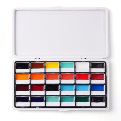
- Fuumuui 24-Color Opaque Semi-Solid Watercolour – Muted Colours
- Fuumuui 24-Color Opaque Semi-Solid Watercolour – Earthy Colours
- Fuumuui 24-Color Opaque Semi-Solid Watercolour – Vivid Colours
- Fuumuui Dual-Tip Watercolour Travel Brushes
First Impressions: Packaging & Design

The design and packaging of the 3 sets are beautiful; the artwork on the boxes is subtle and perfectly illustrates the colours included. The presentation signals to the artist that this is a high-standard product. The packaging is so well-executed that if you were to give these sets as a gift, the recipient would know that every care was taken in the choosing.
The brush set is presented in a durable leather pouch, which is lovely to hold and ideal for travel. Every care has been taken in their production. The brushes feel quite weighty (which I really like), and the black and gold handles offer a sleek, professional design that rests nicely in the hand.
The Painting Process: Applying Acrylic Techniques to Watercolour Medium
Capturing the Sky and Clouds
After sketching the layout with a 2B pencil, I began with the sky. I mixed Ultramarine for the top of the sky and slowly blended into Azurite Blue and Lake Blue to capture the colours of a warm summer day on Anglesey.
For the sky, I tend to prefer Cobalt Blue over Ultramarine, so I added Lavender in very small amounts as a tint. These four colours gave me a pleasing representation of the skies I am familiar with. I laid them down and “blocked in” the sky using the acrylic method, rather than traditional watercolour washes.
I then attempted to thickly paint Titanium White over the blue to form the clouds. Did it work? To an extent, yes. However, to make it less problematic, I decided to "lift" areas of blue to help the paper better accept the white paint. Therein lay my first lesson: the watercolour paper was already showing me who was boss!
Tackling the Sea and Rocks
As I hadn’t quite learned my lesson from the previous "telling off," I tackled the sea in the same way. As a compromise, I went much lighter near the beach in preparation for the waves lapping at the shoreline, using the same blues to maintain balance.
My acrylic mindset wasn’t going to give up without a fight. When it came to the rocks, I went "all in" with my darkest darks. In acrylics and oils, you paint from dark to light; watercolour flips this on its head, moving from light to dark. I wasn't having any of that! I wanted to see what these paints could really do.
I was pleasantly surprised. When I mixed Azurite Blue, Lavender, and White to highlight the tips of the background rocks, the paint responded well after several passes. It was a subtle shift, but it covered the darks! (For the darkest shadows, I mixed Ultramarine, Burnt Umber, and Olive Green for the distant foliage.)
Learning to Listen: Adapting the Technique
I ran into more difficulty with the large foreground rock. The watercolour medium began to teach me another lesson, and this time, I eventually listened.
I found two colours in the Muted set—Green Grey 1 and Green Grey 2—that could tackle the rock without complex mixing. I started with Green Grey 1, a pastel shade of cool green. While the "blocking in" was easy, I realised I needed to switch to a watercolour technique to establish highlights instead of relying on Titanium White.
Because I hadn't started with a light wash, I had to take out pigments with a wet brush and kitchen roll where the sun hit the rocks. If I had adhered to watercolour rules, I would have achieved the look with ease, but my "acrylic stalwart" nature had left me with nowhere to go.
The Finishing Touches

I used Lavender from the Vivid set for elements in the sea; it became a go-to colour for both shadows and highlights. Regarding the use of black—which is often controversial—I used Lamp Black sparingly for the cracks in the foreground rock. My philosophy is that if it’s on the palette, I’ll use it; Turner and Sargent did, after all!
Finally, I tackled the beach. Wet sand often has a hint of Magenta, a "bullying" colour that must be used delicately. I mixed Yellow Ochre, Magenta, Burnt Umber and Burnt Sienna. For the lighter, dry sand, I dropped the Magenta and added a hint of French Grey.
By this point, the penny had finally dropped. I put my acrylic technique aside and used the lightest wash possible for the dry sand. It worked beautifully!
Final Thoughts: My Fuumuui Watercolour Experience
What did I learn from this exercise? The Fuumuui Opaque Watercolour Sets have excellent covering capacity and the colours are vibrant, but make no mistake: it is watercolour.
While I was able to layer the paint and lift colour to correct mistakes, it is far preferable to follow the traditional watercolour rules:
- Work from light to dark.
- Use the white of the paper to your advantage.
- Don’t bury your highlights in dark pigment.
If you are new to watercolour like me, you will get the best results by studying how the paint wants to be used. If you are a seasoned watercolourist, I hope you found my struggle entertaining! I am excited to use these sets again—but next time, I’ll leave my acrylic habits at the door.
Happy Painting!


