


Table of Contents
Key Takeaways
Verdict: Watercolor's soft edges and translucent layers make it the ideal medium for creating romantic, handmade Valentine's Day cards for any skill level.
- Full Screen of Hearts: A beautiful exercise in transparency using overlapping hearts and the "lift" technique to create depth.
- Heart-Shaped Wreath: A classic focal-point design that frames a central heart with delicate floral petals and greenery.
- Floral Heart Bouquet: A modern, chic aesthetic combining a solid heart base with loose organic elements and an artistic splatter effect.
Looking for novel Valentine's Day watercolor card ideas this year? Whether you are a seasoned artist or a "non-artist" wanting to surprise your partner with something handmade, Fuumuui is here to help. Watercolor is the perfect medium for romance; its soft edges and translucent layers mirror the delicacy of the heart.
Below, I will guide you through three unique designs using professional techniques simplified for everyone.
Essential Watercolor Painting Supplies
Before we begin, clear your workspace and gather these essentials:
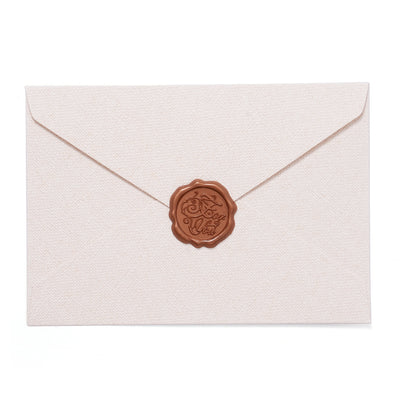
- Watercolor Cards: Postcard size is best, so you can put your finished artwork in an envelope and give it away.
$24.00$18.99
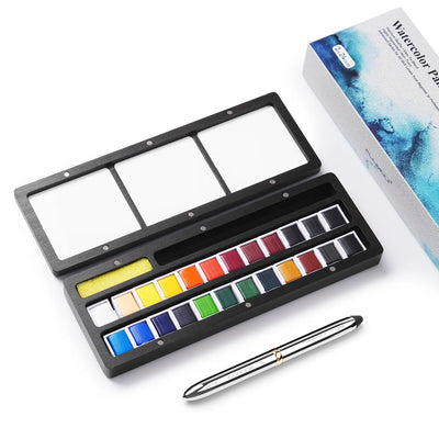
- Watercolor Paint Set: Includes 24 colors of paint, 1 dual tip brush with round and detailed tips, and a wooden palette.
Idea #1: The "Full Screen of Hearts"
This tutorial will guide you step-by-step in creating a full screen of hearts. Materials needed include rose red, alizarin crimson, and scarlet paint, along with masking tape and a pencil. Special tip: You can complete this using only a simple round brush.
We will create a "staggered" effect where hearts overlap, creating new colors where they meet. For a deeper look at how pigments interact, you can explore our watercolor mixing guide.
You can also watch our tutorial videos.
Step-by-Step Instructions
01
The Base Layer
Secure your card with masking tape to maintain clean edges. Mix a light "wash" using 2/3 water and a touch of Scarlet. Lightly paint heart shapes across the card, leaving plenty of space between them to allow for future layers.

02
Creating Depth
Once the first layer is bone-dry, mix a medium-concentration of Rose Red (using a 1:1 water to paint ratio). Paint new hearts in the available gaps, intentionally overlapping the first ones to create beautiful secondary tones.

03
Capturing the Sparkle
Artist Tip: As you paint, leave a tiny white "highlight" on the shoulder of each heart. This use of the paper's natural white makes the hearts sparkle and prevents the design from looking flat.

04
The "Lift" Technique
While a heart is still wet, clean your brush and dry it on a paper towel. Gently use this "thirsty brush" to lift paint from the center of the heart. This sucks up excess water, creating a soft gradient and revealing the subtle layer underneath.

05
Final Flourish
Continue adding staggered layers with Alizarin Crimson until the entire screen feels full and balanced. Once completely dry, add your personal touch by hand-writing your greeting in the center.

Idea #2: The Heart-Shaped Wreath
A wreath symbolizes eternity, making it a perfect sentiment for Valentine's Day. This design uses a "focal point" strategy often seen in Victorian-era greeting cards.
Materials needed include: watercolor cards, 24-color watercolor set. You will need skin tone, alizarin crimson, and sap green.

You can also watch our tutorial videos.
Step-by-Step Instructions
01
The Blueprint
Begin with a light pencil sketch of a heart outline in the center. Once satisfied with the shape, fill the interior with a very diluted Skin Tone or pale pink wash. This creates a soft, glowing anchor for your wreath.

02
The First Bloom
Wait for the foundation to dry completely. Using your finest brush, draw simple, loose petals around the heart's perimeter. Remember to start with your lightest colors first to keep the transparency fresh.

03
Building Saturation
Layer more saturated Alizarin Crimson onto the centers of the flowers to create a professional 3D effect. Since watercolor is naturally translucent, these darker pigments will allow the bottom layers to "glow" through.

04
The Greenery
Using Sap Green, draw a delicate, curving vine to connect the flowers. Be mindful not to over-crowd the design—let the "white space" of the paper breathe to maintain the card's elegance.

05
The Message
As a final touch, use a steady hand to write your loved one's name or a short blessing inside the central heart. This personalized message transforms the artwork into a cherished keepsake.

Idea #3: The Floral Heart Bouquet
This design is for those who love a "fresh," modern aesthetic. It combines structured shapes with loose, organic floral elements. You only need to prepare greeting card paper and 24 colors of watercolor paint to complete the drawing.
You can also watch our tutorial videos.
Step-by-Step Instructions
01
The Foundation & Texture Check
Paint a solid heart in the center of your Fuumuui watercolor card. You can sketch this first or go "freehand" for a more organic look.
Pro Tip: To check if it’s dry, look at the paper surface from an angle. If it's no longer reflective or "shiny," it’s ready for the next layer.

02
Painting the Bouquet
Use Orange and Alizarin Crimson to paint small, irregular petals over the top of the heart. Don't aim for perfection—the variety in shape and size is what breathes life into the bouquet.

03
Fluid Stems
Using a small detailing brush and Sap Green, connect the petals to the heart. For a professional, calligraphic look, vary the pressure on your brush to create a natural mix of thick and thin lines.

04
The Splatter Effect
If the card feels too "empty," dip your brush in wet paint and gently tap it over the card to create tiny artistic dots. This "splatter" adds a minimalist-chic energy and completes the modern aesthetic.

Watercolor Technique FAQs
Q1: Why is My Paint Flowing Everywhere and Ruining the Shapes?
A: This usually means there is too much water on your brush or paper. To maintain control, try "blotting" your brush on a paper towel immediately after dipping it in water; this removes the excess while keeping the bristles damp enough to hold pigment.
Q2: How Do I Get Those Sharp Edges on My Hearts?
A: The secret is the "Wet-on-Dry" technique. You must ensure your paper is completely bone-dry before touching it with a wet brush. If the paper remains even slightly damp, the edges of your heart will "fuzz" or bleed into the surrounding fibers.
Q3: My Colors Look Dull Once They Dry. What Happened?
A: Watercolor naturally undergoes a "drying shift," typically appearing about 20% lighter than when wet. To achieve more vibrant cards, adjust your pigment-to-water ratio by adding more paint to your mixing palette for a higher saturation.
We invite you to share your handmade creations with us! If you've followed these tutorials, tag @fuumuui on Instagram or YouTube so we can celebrate your progress.
If you'd like to see more of fuumuui's artwork, you can find it on Instagram and YouTube.


